Landing Page Design
HomeUtilities – Smart Expiry Tracker App
Landing Page Design | UX + UI Concept
Background
HomeUtilities is a smart expiry tracking app designed to help users reduce food and medicine waste effortlessly. The app lets users simply snap a photo of their groceries or medicines, and it automatically detects expiry dates, sends timely reminders, and even suggests recipes for ingredients nearing expiry.
The goal of this landing page was to convert visitors into app downloads by communicating the product’s value quickly and visually.
The goal of this landing page was to convert visitors into app downloads by communicating the product’s value quickly and visually.
Role
Project Type: UX/UI Design – Landing Page Design
Timeline: 2 weeks
Role: Product Designer (UX/UI)
Tools: Figma, Adobe Illustrator, Photoshop
Challenge
Many people forget expiry dates of groceries or medicines, leading to unnecessary waste and financial loss. The challenge was to design a landing page that communicates trust, simplicity and usefulness - all within a few seconds of a visitor arriving.
Design Objectives
- Instant Clarity: Use bold copy and clean hierarchy to make the value proposition clear (“Your Home, Closer Than Ever!”).
- Emotional Resonance: Highlight relatable frustrations (tracking that medicine cabinet?, throwing expired food?) to trigger empathy and motivation.
- Visual Storytelling: Use mobile mockups to show the app’s core flow — photo capture, detection, reminders, and recipe suggestions.
- Smooth Conversion Flow: Include clear CTAs (“Get on App Store / Play Store”) and concise FAQ to handle last-minute objections.
UX Approach
- Problem Framing: Started by identifying daily struggles of users who often forget expiry dates or overstock groceries.
- Content Hierarchy & Flow: Created a concise one-page layout that guides users through awareness → understanding → conversion.
- Copy Strategy: Framed messaging around outcomes (“Save Money”, “Stay Fresh”, “Cook Smart Recipes”) rather than features.
- Visual Hierarchy: Designed clear contrast between blue gradients (trust and freshness) and clean white space for legibility.
UI Design Highlights
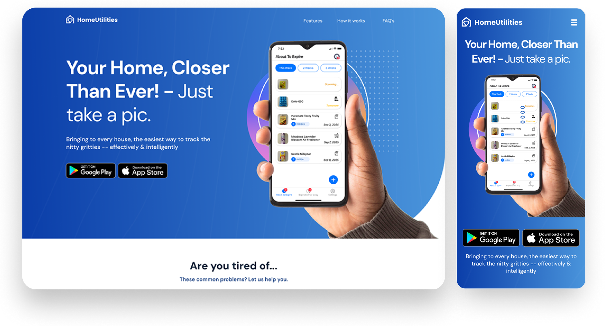
Hero Section
Combines a bold promise, a real app mockup, and direct CTAs to drive immediate engagement.
Combines a bold promise, a real app mockup, and direct CTAs to drive immediate engagement.
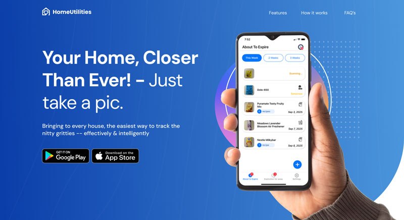
Problem–Solution Flow
Sections like “Are you tired of…” and “What if you could…” build a logical narrative.
Sections like “Are you tired of…” and “What if you could…” build a logical narrative.
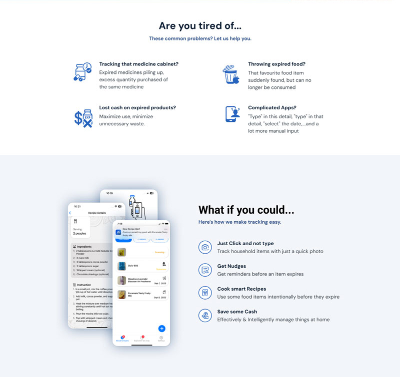
How It Works
Step-by-step visual explanation reduces cognitive load and boosts comprehension.
Step-by-step visual explanation reduces cognitive load and boosts comprehension.
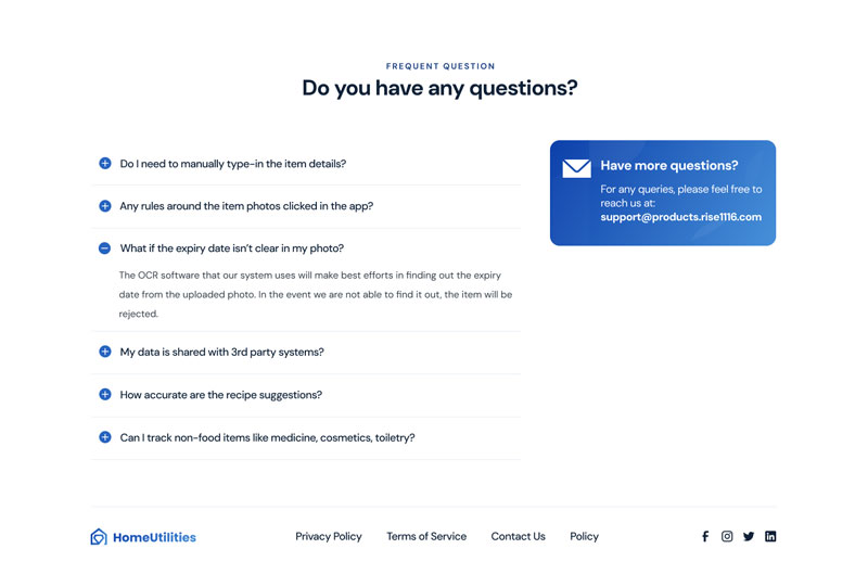
FAQ Section
Addresses potential user concerns, building confidence and transparency.
Addresses potential user concerns, building confidence and transparency.
Outcome
The landing page effectively delivers a sense of trust, clarity, and ease, encouraging users to take action instantly. It showcases the product’s purpose, functionality, and emotional benefit in a cohesive, modern design.
Next Steps
In future iterations, the focus would be on A/B testing headlines, CTA placement, and personalized visuals to further optimize conversions.